Wander Responsive Website

Web Design, E-Commerce
Project Overview
I was tasked with creating a responsive e-commerce website for an outdoor outfitter which was compatible both on desktop and mobile experiences
Problem
Users may struggle without guidance to buy quality items that align with their values and sustainability initiatives.
My Contributions
Lead UX Designer, Researcher
Duration
April 2025 - August 2025
Solution
The goal of this project was to organize a large inventories in an intuitive way with the ability to find specific items quickly so the user can make an informed decision on their purchase
RESEARCH and Ideation
Summary
I conducted a competitive audit to understand how popular e-commerce sites were organizing their inventories for ease of use and accessibility for all users. Based on that research I created a site map which took the best UX practices from these brands and condensed them into a simple and scalable architecture for this project.
Pain Points
Inventory size creates navigation issues
Lack of transparency leaves customers lacking assurance
Sustainability is an after thought in online shopping.
Persona
Jake is an outdoor enthusiast who needs a simple and informative way to search for outdoor gear so that he can make eco-friendly purchases.
Starting Design
Information Architecture
With my research in hand, I began developing a useable information architecture that would fit the mental modal of target users and expedite their shopping experience.
Figma Link
Information Architecture
I began my wire-framing process to get a better idea of what elements I wanted on each screen. I decided on the key flows I needed for my check out flow in this stage which include:

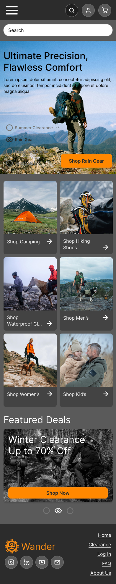
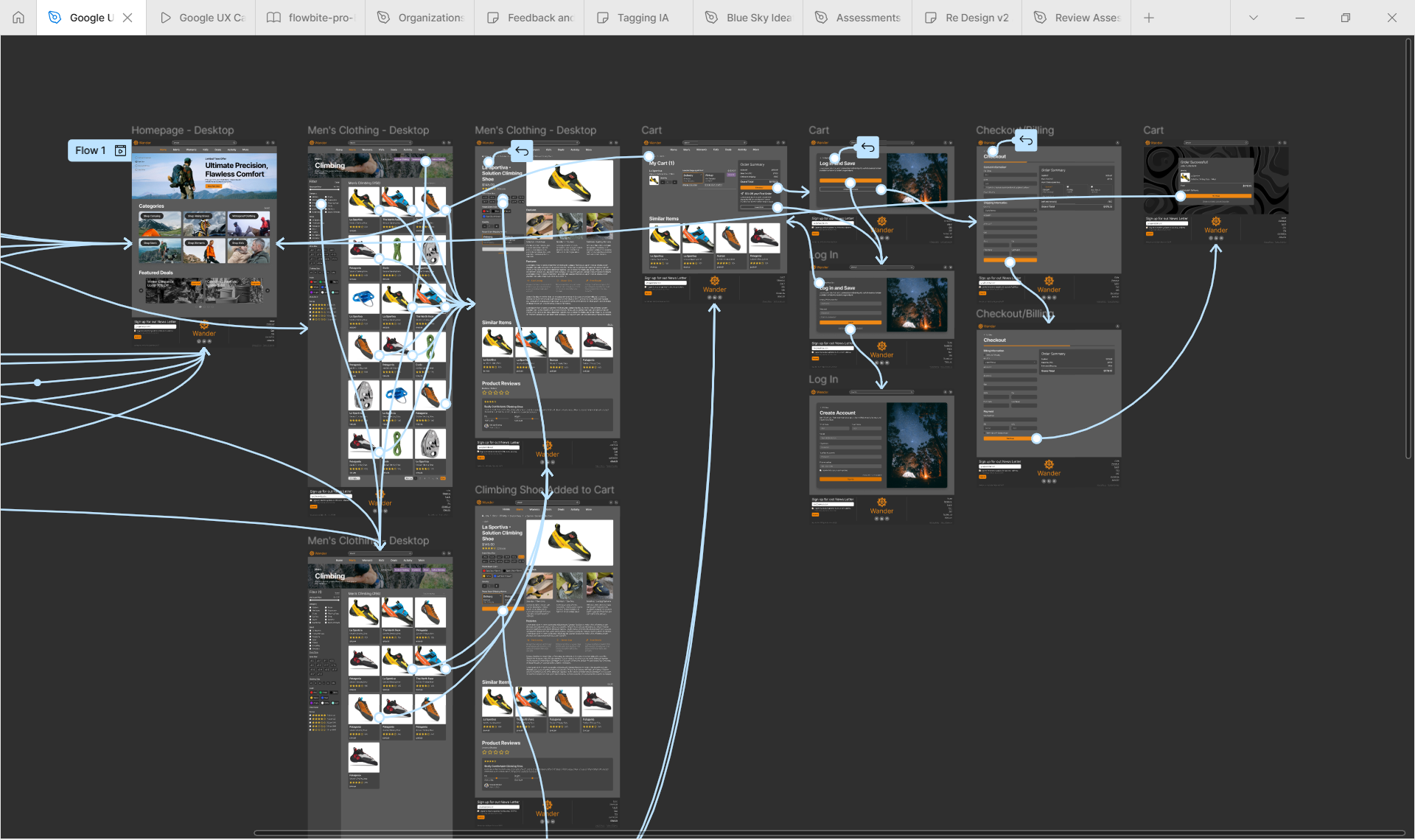
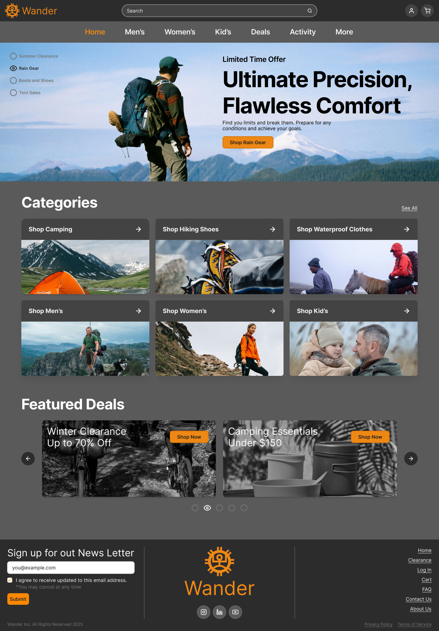
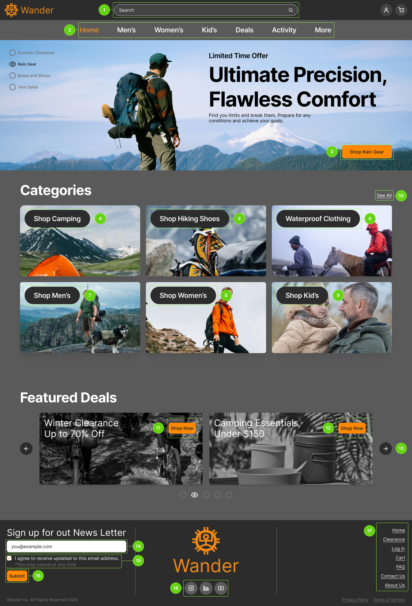
1. Home page with navigation
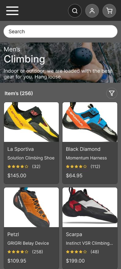
2. Inventory list with adjustable filters
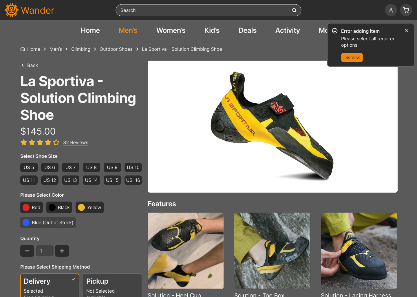
3. Item Details view with reviews and suggestions
4. Cart with suggestions and promotions
5. Shipping and billing checkout screens
6. Order confirmation and return to home

Details
At this point I also began adressing issues with navigation to make a smoother shopping experience such as including bread crumbs and laying out the mega menu in an intuitive way.
Refining Designs
Mockups - Desktops
I took an initial pass at creating mockups and putting them together in an interactive prototype with which I would conduct a series of moderated usability studies to discover ways to improve the designs.
Mockups - Mobile
As part of this project I also devloped mobile frames
Hi-Fi Prototype
I used the Hi-fi mockups to create an initial hi-fi prototype which I then utilized in a moderated usability study.
Figma Link
Refinement
At this point I felt ready to test my assumptions and refine my designs with real user feedback. I conducted 3 moderated usability studies where I asked participants to complete tasks and rate the usability of the system.
I changed the UI surrounding the categories so they would no longer obstruct the sample images.
I also added a more robust notification system to help keep the user on the happy path to ordering their items.
Accessibility Considerations
I also took time to annotate my designs to be accessible for users with disabilities. I established hierarchy and used annotations to create a clear path for screen readers to follow.
Impact and Takeaway
I received positive feedback about my designs from my usability study participants. Which confirmed my assumptions about usability and accessibility
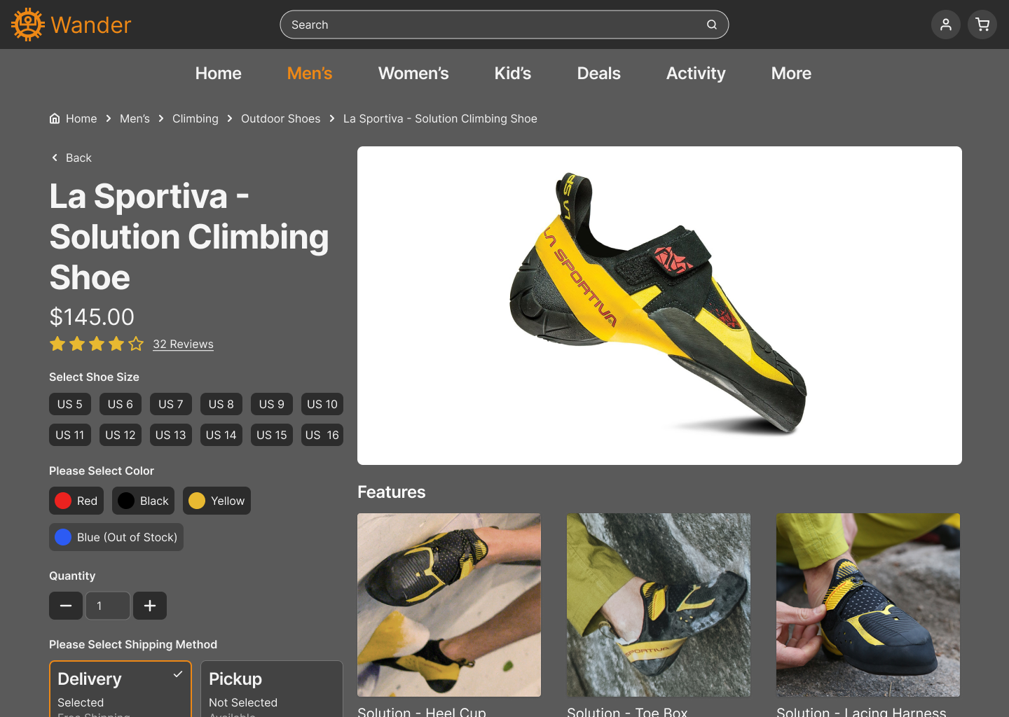
"I like it. It fits the mental model… it's a nice design, and it gives me all the information I would want about the product"
- Participant C
I also learned that while it is difficult to fully parody a real website’s behavior using prototyping tools, it is not impossible, and there is a great benefit to expanding prototype functionality to ensure the user remains on the happy path.
Next Steps
  • Continue refining the prototype in a second version the more accurately displays hover states and multiple paths through the website
  • Fully implement mobile prototype to explore if usability changes with smaller screen sizes
  • Refine this case study and add it to my portfolio website