FOOD 
ORDERING UX

Developed for Google UX DESIGN

Project Overview

This self directed project was completed for the Google UX Design Course. Based on a randomly generated prompt to create a mobile food and beverage ordering experience for a beer garden, I conducted background research and created a functioning prototype application.

I focused on the key areas of simplicity and accessibility to ensure that users of all abilities could navigate the application.

Responsibilities

Complete Project

Outcome

  • Learned rapid ideation and wireframing techniques
  • Learned fundamentals of user research
  • Learned fundamental of usability testing to enhance designs

Research

Through interviews, two personas were developed. Marla is a 36 year old Therapist with a vision impairment that can make ordering from menus and apps difficult. She likes trying new things and prioritizes being social to balance and unwind from her demanding job. 

Dan is a 50 year old entrepreneur who is motivated to work hard by his family of 5. He recently has come to terms with his unhealthy relationship with work and is looking to incorporate more leisure time. He also is taking ownership of his health and following a stricter diet. He stays away from alcoholic beverages but will enjoy a non-alcoholic beer with friends every once in a while.

Pain Points

1
Apps Without Accessibility
2
Lack of Dietary Info
3
Need for More Quality Time

Personas

Based on the personas, a basic user journey was created to better understand needs and pain-points that the app would need to address to be successful.

Audit

A competitive audit was also conducted to better understand the market.

To be competitive, the application must offer a balance between accessibility and cutting edge UX standards to save time at key screens such as checkout and delivery.

There are many opportunities to increase accessibility for vision impaired users and users with dietary restrictions.

Ideation Process

Armed a wealth of user research, I began to rapidly iterate using freehand sketches.

I worked off of a user flow based on the research I had conducted to make sure I was creating a cohesive experience from the very start.

Digital Wireframes

The strongest designs and key elements of the paper wireframes were converted into basic digital wireframes. Even at this stage I began to refine the designs to consider usability for individuals with vision or auditory impairment.

Prototype and Usability Testing

With the lo-fi designs completed, I sought to test my design decisions with a real audience. I collected a group of 3 participants and conducted a moderated usability study to determine how to best improve the designs before finalizing them.

Research Findings

1
Need for a search bar
2
Button text to clarify purpose
3
More affordance on key CTAs

Hi-Fi Mock-ups and Prototype

After modifying the designs to be more user-friendly, I finished the project by creating a set of mockups and a high fidelity prototype. Given the constraints of the project, this was my best attempt at creating production ready designs that met user needs

Reflection

Working the end to end process from research to Hi-fi prototyping was an immensely rewarding experience. It also permitted me to keep the focus on the user throughout. Having qualitative and quantitative research to back design decisions, even with a limited research group, was a powerful resource.

I believe this process revealed a strength for synthesizing complex information and exposed a weakness of refining and execution of designs that I will work to correct in later projects.
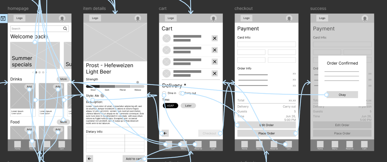
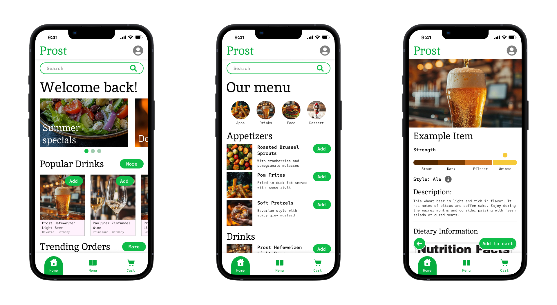
"I like how the app surfaces key information throughout the process"
- Research Participant 3